| Web
and Book
design,
Copyright, Kellscraft Studio 1999-2007 (Return to Web Text-ures) |
 (HOME)
|
|
CHAPTER
I
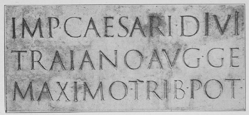
HISTORICAL OUTLINE "If we set aside the still more wonderful invention of speech, the discovery of the alphabet may fairly be accounted the most difficult as well as the most fruitful of all the past achievements of the human intellect." For the general student of history, as well as the art student, the study of palaeography is an interesting one. Canon Taylor, from whom the above quotation is taken, has written a history of the alphabet1 in two large volumes which is accepted as standard, although some of his theories are disputed by other palaeologists; and a bibliography of other works, both historical and practical, will be found at the end of this book. It is sufficient for us to say that our letters are the result of a long evolution probably from the Egyptian and through the Phoenician and Greek to the Roman. The forms of the letters of our present alphabet (with the exception of j, u, w, y, and z) reached their full development about two thousand years ago, and have been preserved for us on the Roman inscriptions of that period. This early letter, which we now call Old Roman, is the parent of all the styles, however diversified, which are in use to-day, and curiously enough, instead of being archaic, is the most useful and artistic one for the designer.
 FIG. 1.—Portion of Inscription on the Trajan Column.
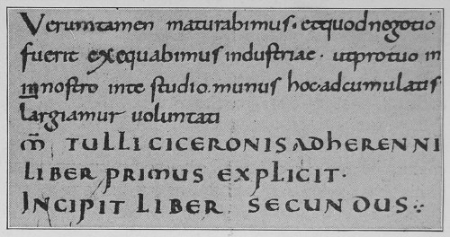
This monumental form was used in the earliest Latin manuscripts with such modifications as would naturally arise from the use of the pen instead of the chisel. A variety known as rustic, although this name has nothing to do with its appearance, was in use also from the second to the fifth century. This form, however, is of no practical value to us. In the fourth century there was developed the uncial, a letter with beautiful curved outlines and of great value to the designer. In the evolution of this form, the Irish half-uncial, now known in design as Celtic, reached a degree of perfection and beauty never since surpassed. The wonderful book of Kells (early eighth century) in the Dublin museum is perhaps the finest example of lettering and illuminating extant. It will be noted that up to this time there was not a separate alphabet of capitals and small letters; not until the latter part of the eighth century was this distinction made. This period marks an epoch in the history of writing. Charlemagne in 789 ordered the revision and rewriting of all the church books. In the activity in the monasteries which followed, Alcuin of York, the friend and advisor of Charlemagne, and who was Abbot of St. Martin's of Tours, developed an alphabet of lower case letters, which has been known ever since as the Caroline (Carlovingian) minuscule. Our present script writing is the direct descendant of this Caroline letter.  FIG. 2.—From a Ninth Century Manuscript.
Figure 2 is a reproduction of a ninth century manuscript, showing this letter written, it will be noted, with a slanted pen. This full round letter gradually became more compressed as parchment became more expensive, and is known from the eleventh century on as Gothic. During all this time, the old Roman capitals were in constant use as initial letters. This Gothic reached its extreme limit of angularity and compression in the fourteenth and fifteenth centuries, when the curves had given place entirely to angles. When the letter is so much compressed that the black strokes are wider than the white spaces between, it is known as blackletter. The form commonly known as Old English is an English Gothic of this period. The Italians, who never followed the extreme angularity of the English and German Gothic, went back in the period of the Italian Renaissance (fifteenth century) to the Caroline minuscule as a model, and designed the Roman small letters, the letter of our books of today. The architects of the same period in their revival of classic architecture remodeled the old Roman capital letters for monumental use. At the invention of printing in the middle of the fifteenth century, the first types were cut in imitation of the Gothic writing of that period, but soon afterwards (1468) type was cut on Roman lower case. Throughout the next century books were printed both in Roman and Gothic. The Roman finally replaced the Gothic entirely, except in Germany, whose modern German text is the sole survivor of the mediaeval form. In the sixteenth century, the Italic was designed. The graceful French script, the letter of the period of the Louis' followed. In the eighteenth century the modifications which resulted in the modern Roman occurred. In the nineteenth century was begun the use of the bold letter, which we call Commercial Gothic. The present century is witnessing a most extensive revival of good lettering. The leaders in this movement are the German secessionists and the varieties of letters which they are producing may be classified under the general term of Art Nouveau.
_______________________
1 The Alphabet, Its Origin and Development. Isaac Taylor, London. |